Sign Up or Sign In, Does it Even Matter?

The Idea
Like any startup, at Buffer we are always looking for ways to reduce friction at every stage of using the product, from the moment you land on the homepage to the daily use of our browser extensions and web app.
One of the key points in the user lifecycle is getting people over the hurdle of signing up for your app, of course this should be as seamless as possible, particularly in the consumer internet space. In the last few years this has become easier than ever - with the advent of OAuth solutions such as Facebook Connect and Twitter Sign In users often no longer need to enter any details at all to sign up for your service.
This got us thinking could we completely remove the barrier of signing up all together? Could we make the account creation experience so easy that you might not even notice it had happened?
The Approach
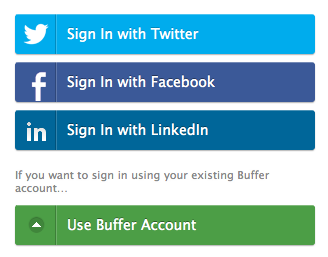
While there are some intricacies to handling a combined signup / signin on the server the first step is authorising the user with their social network of choice - and of course the UI is simpler than ever. We decided on a familiar ‘stack’ of social networking buttons that can be consistently reproduced in all of the different sign in locations we have (web, browser extension, mobile).
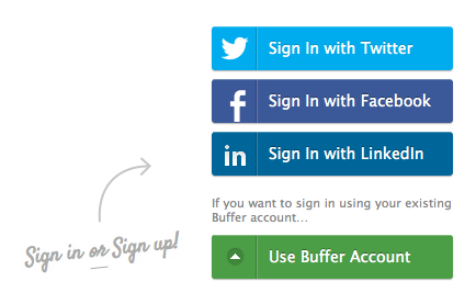
Our sign in screen, as seen on mobile.
On the web app the stack sits on the right hand side of our homepage and acts as a bright, strong call to action to. As more networks are added in the future we will likely add a “more options” button combined with a memory of the users last sign in choice which will always be displayed at the top of the stack.
Choosing the wording ‘Sign In’ on the buttons rather than ‘connect’ or other alternative wording hopefully gives the subtle impression that even new users already have an account and they just need to sign in to access it. The key is with ‘Sign In’ you don’t expect to have to do any more work, which makes the hurdle smaller.
Key Lessons
Users are often looking for the words “sign in”, “sign up” or “log in”
Even (or perhaps especially) with a combined signup / sign in it is important to make it very clear that the user can do both actions with the same buttons. We included a friendly note on every entry point to get this message across
Let people know that they can do both actions in the same place.
Many people forget which social network they used previously
This is one of the biggest problems we had after rolling out the changes, many users were forgetting which social network they had used to login and were creating two, three and even more accounts. Obviously this is a terrible user experience and it can also completely skew your metrics.
We dealt with this situation in a couple of ways; by storing a separate long-life cookie whenever a user signs in we can check on signup if a user has been to Buffer before - we catch people that try to sign up with the cookie and display a screen like this:
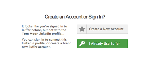
Detect and give users the option to sign in again.
Inevitably some users still fall through the cracks, perhaps because they clear their cookies or simply click on ‘create account’ anyway. In these cases we need to let them merge their accounts together.
In Buffer we allow users to connect additional social media accounts on the dashboard, when the feature was first launched connecting an account already in the system would throw an error with a message to contact support - this would affect anyone who had accidentally created two accounts! As you can imagine, merging accounts quickly became one of our biggest support requests.
Thankfully we have now completely removed this friction point also, as authorising with the social network is proof of ownership connecting an account that is already in the database simply merges the two together, seamlessly in the background.
What about their email?
The disadvantage of users signing up with a social network is that you can’t always get their email address and other details that may be important for your business. At Buffer we use the email to send alerts if there are any problems or if your Buffer becomes empty as well as optional newsletters and lifecycle triggered retention emails.
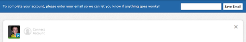
The passive email banner
Rather than immediately hassle the user after signing in with a social network (that kind of defeats the point, doesn’t it?) We opted to display a more passive banner at the top the dashboard which lets the user know the reason we would like to have their email address, this works well and only displays after a welcome tour which means the user is much more invested in the product than they would have been if asked on a signup page.
Conclusion
So, does it matter? I would say that with the right measures in place to catch and automatically repair duplicate accounts it doesn’t matter at all and in fact reducing complexity of the sign up process is well worth these measures.
It is now very rare that we get any of the support issues above and because the nature of Buffer is managing and connecting many social accounts we were probably more inclined to get these types of problems than many apps would be.
Have you implemented social sign in differently or had interesting problems with it in the past? I’d love to hear your solutions and thoughts in the comments
Photo by nickuzma