Realtime Analytics at Buffer with MongoDB
At Buffer we try our best to be a data-driven startup, it can be hard work measuring, testing, correctly reading the data and then acting on these results - we definitely still have a lot to learn. Currently we use a combination of third party tools such as Kissmetrics and Google Analytics as well as our own hand-rolled metrics for internal data.
The area where we are most happy with our approach is in measuring internal statistics, for example how many people used the latest Firefox extension last week, or how many API requests to which endpoints were there in the last 2 hours or which website with the Buffer widget provided the most signups last week?
To make informed product decisions we need to easily access and visualise key business data in realtime.
Using MongoDB to measure realtime stats
Our current tool of choice is MongoDB, using a combination of atomic ‘inc’ methods and ‘unsafe’ saves we can update key metrics in the database blindingly fast with a negligible affect on performance of the front end (as the driver doesn’t wait for save success before continuing).
By storing these statistics in minutely, weekly or hourly batches we can also limit data growth to a predictable rate and increase read speeds in the admin area.
    db.clients_by_time.update({
        'hour': $hour,
        'client_id': $client_id
    }, {
        '$inc' => array(
            'requests' => 1,
            'statuses.'.$status_code => 1,
            'endpoints.'.$endpoint => 1,
            'response_time' => round($response_time)
        )
    }, true);
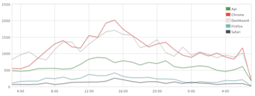
The code snippet above is inspired by this post on the mongodb blog and is used to record the performance usage of Buffer API clients. It allows us to produce detailed graphs like the following in realtime and with upto the second data.
A typical API client
Several individual values are incremented, one for the total requests as well as individual status codes and endpoints.
Sometimes tricks can be used to allow the use of incrementing values where you might not usually, for example in the above code ‘response_time’ is incremented with the response time of each API request - the value becomes the sum total of all API requests in the hour. It is then easy to calculate the average when we return the document by dividing by the total requests. To store the average in the document itself would require an extra query for every request and this is well worth avoiding!
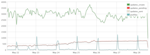
Buffer update sources
Where to go from here
We believe that this approach scales exceptionally well and it has certainly done us proud so far.
As the dataset grows it is inevitable that we will want to automate weekly, monthly and eventually yearly rollups and with only 168 documents created per collection, per week for data recorded hourly this is a task that can be easily performed in code rather than requiring map reduce.
By far the biggest area for improvement is in our display of all the data we are gathering. At the moment this is largely using simple line graphs with raw values over time (we don’t even have a way to go back to previous weeks yet!). Some of the analytics would also be much better expressed as percentages of a total, stacked graphs or one of the many other types of charts.
Have any thoughts on our approach? Have you tackled things differently in your company? I would love to hear them in the comments.
Further Reading
- Using MongoDB for Real-time Analytics The original mongodb blog post that inspired this approach.
- MongoDB Real-time Data Collection and Stats Generation
- Fast, easy, realtime metrics using Redis bitmaps Not a method we are currently using, but a very interesting approach to the problem solved using redis bitmaps.