How We Increased Our Conversion to Paying Users by 171%
At Buffer we are currently focused on driving growth to a new level, in the process we are trying many different channels to increase the number of visitors and signups including content marketing, web stores, mobile markets and more.
In the past week I decided to take a quick look at our homepage and how we might improve our conversion instead of driving more new visitors - after all, if we can improve the conversion whilst still increasing visitors it has a compound affect!
Previously we have not had much luck with A/B testing, it’s something we often do and have infact built an internal library called ‘Einstein’ which makes it super easy for anyone on the team to deploy a one-line split test anywhere in the product. We have continuously been amazed at how seemingly large changes can actually make very little difference to conversion and activation, particularly in the early days of the product (more on this later).
Examples of Some Failed A/B Tests
Homepage Tagline Changes
This is an area we predicted would have a big effect, the thinking being that the main headline on the landing page would be a driving factor in whether people are interested in the value (and we all know not many users read further than the headline!).
In the early days Joel tested between several variations of text including “Be awesome on Twitter”, “Get 200% more clicks on Tweets" and "A Smarter Way to Share”. Unfortunately none of these variations had a significant impact on conversion.
Colour of Call to Action
After meeting Tim Ferris, he suggested that we try a higher contrast, orange call to action. At the time we had a single signup button that was a dark shade of green. The difference was similar to below (although unfortunately we don’t still have the exact screenshots).

The two variations used, with a bright central call to action.
Positioning Changes
We also tried moving the main call to action on the homepage to see if this would have any impact, flipping the page horizontally as well as trying a stark version with no introductory video and a large central signup button! The affect? Negligible.
Interstitials vs Dropdowns
We have also done split tests on internal product features and design variations, one in particular showed 50% of new users an interstitial to install our browser extension whilst the other 50% saw a drop down bar once they began using the product. The hope here was to increase the activity of new users by ensuring they installed the extension, but after running the test for several weeks the cohort analysis showed no discernable difference.
The First Successful A/B Test
In the past week we ran a new A/B test on the homepage that shows potential users more detail about Buffer, in particular some of our most popular features run directly below the signup box (multiple accounts, analytics and team members). The hypothesis was that potential users are now discovering Buffer through more channels than just our content marketing efforts and a lot of people might not understand how much Buffer can offer when they first land on the page.
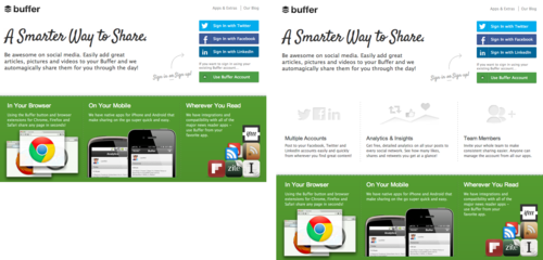
The two variations used, original on the left and the variation on the right.
We are now tracking all of the tests we perform with Kissmetrics which enables us to easily produce reports for our entire funnel, which currently looks like:

The results (and the trigger for this post!) seem to be for the first time both very positive and statistically significant although entirely unexpected. Every point in the funnel proved to be outperforming the original by multiple percentage points, but in particular upgrades were up a whopping 171%.
This outcome was totally unexpected and also shows the importance of tracking your split tests at a macro level, and not just whether there were ‘more clicks on the button’. In this case we would have seen that the increase in signups was statistically insignificant and could have even reverted back to the old layout!
Conclusions
It Takes Many Tries
A/B Testing is difficult! It could be easy to conclude from the many posts highlighting successful A/B tests that getting clear cut results is simple and you too can double your signups by changing the colour of a button but for us that wasn’t the case.
So far we’ve found that getting statistically significant results tends to take many iterations and much bigger changes than you might imagine, I don’t doubt we will need to perform many more tests to get another significant result of this type.
Where Your Visitors Come From Makes a Difference
Many of the unsuccessful tests listed above were performed in the first eight months of Buffer’s life, at this point in time our inbound traffic was much smaller and the traffic we did have often came from early adopters and detailed blog posts explaining how to use Buffer in great detail.
I am sure this will have had an affect on the results as a larger percentage of these users will have hit the homepage knowing what Buffer is and knowing they wanted to try it out. This may go someway to explaining why many of the tests in the early days displayed little variation at all.
Have you had a run away split test success or perhaps you’ve tried hundreds of variations with no results - I’d love to hear your stories in the comments!
Resources
- KISSmetrics - Particularly tailored to enable easy tracking of SAAS metrics.
- A/B Significance Test - Handy tool to measure if your results are statistically significant.
- How not to run an A/B test - Why you shouldn’t peak at your results early.
- A Practical Guide to Controlled Experiments on the Web - The techniques used for experiments at Amazon, Microsoft and NASA.